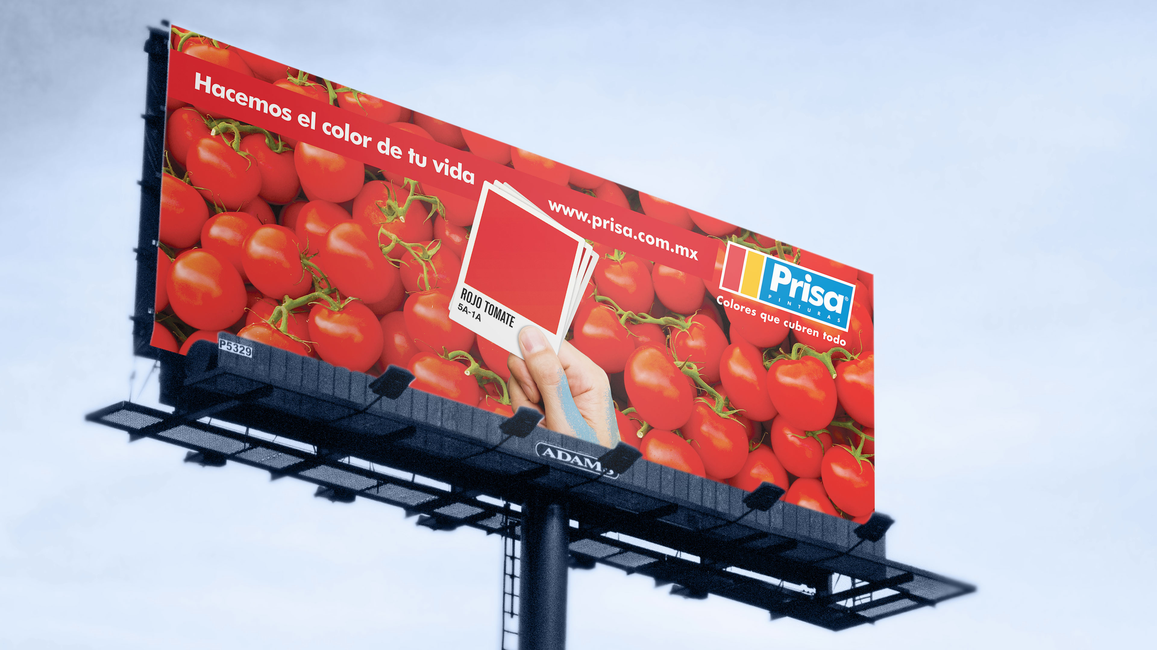
The intent behind this project was to make the brand feel closer to their consumers. To generate this empathy we proposed the usage of the names of colors that people commonly refer to, in place of reducing them to technical denominations.
Under this concept we created a catalogue that referred to the emotional experience of color, taking advantage of textures and elements from nature that humans have used historically, to communicate their unique version of every tone simplifying them, such as: “sky blue”.


Esta entrada también está disponible en: Spanish